Each station picks its own color theme, and the store picks one accent color for all of them. Both are about comfort and legibility where the screen sits. Neither changes how the register works.
Themes
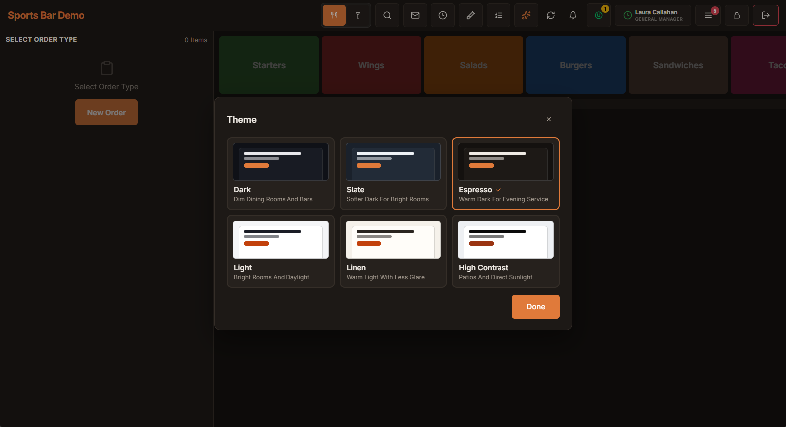
There are six themes: three dark and three light.
| Theme | What it looks like | Where it suits |
|---|---|---|
| Dark | Blue-black. | Dim dining rooms and bars. |
| Slate | A softer, lighter dark. | Bright rooms where Dark feels too heavy. |
| Espresso | A warm brown-black. | Evening service and warm, low lighting. |
| Light | White and cool grey. | Bright rooms and daylight. |
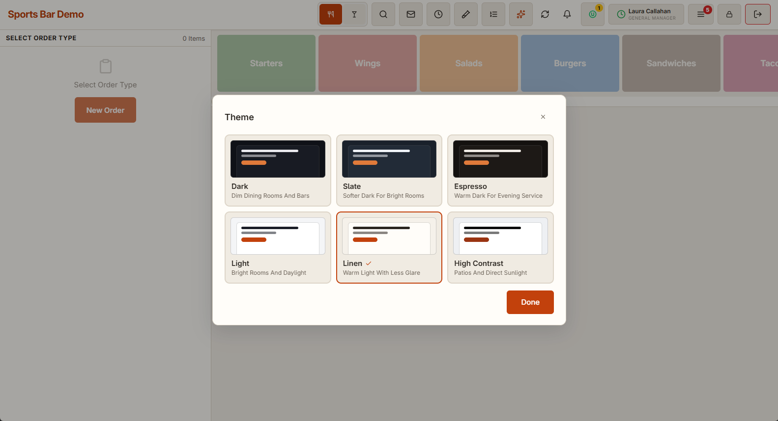
| Linen | A warm off-white. | Bright rooms, with less glare than Light. |
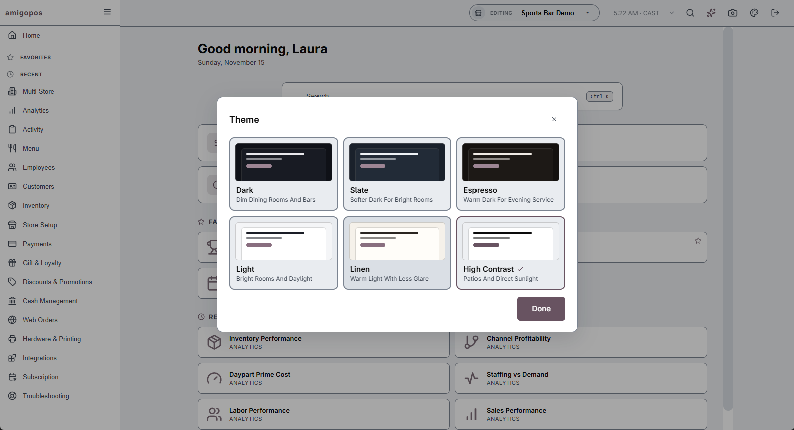
| High Contrast | Near-black text and strong borders on white. | Patios, direct sunlight, and anyone who finds the others hard to read. |
Changing the theme at the register
- Open More.
- Tap the palette button at the bottom of the menu. The menu closes and the theme picker opens over the order screen.
- Tap a theme. It applies at once and the picker stays open, so you can compare themes against the screen behind it.
- Tap Done.
Changing the theme in Back Office
Back Office has a theme of its own. Tap the palette button at the top right of Back Office and pick one the same way.
What to know
- The theme is per station. A bar terminal can use Espresso while the host stand uses Linen.
- On each station the register and Back Office remember their own theme, so one can be dark and the other light.
- The theme belongs to the station, not to the person signed in, and it is kept when the app restarts.
- Colors that carry meaning stay the same in every theme: table and order statuses, the colors given to menu buttons, and red for warnings.
Accent color
The accent is the color of main buttons, links and highlights. It is orange unless the store chooses its own in Back Office › Store Setup › General Settings › Appearance. Unlike the theme, it is one setting for the whole store. See General settings.
Touch or mouse mode
Next to the palette button, the keyboard / hand switch tells the interface whether it is being clicked or touched. Touch mode gives larger hit areas and skips hover behaviour that means nothing on a tablet.
Real sizing lives in Layout
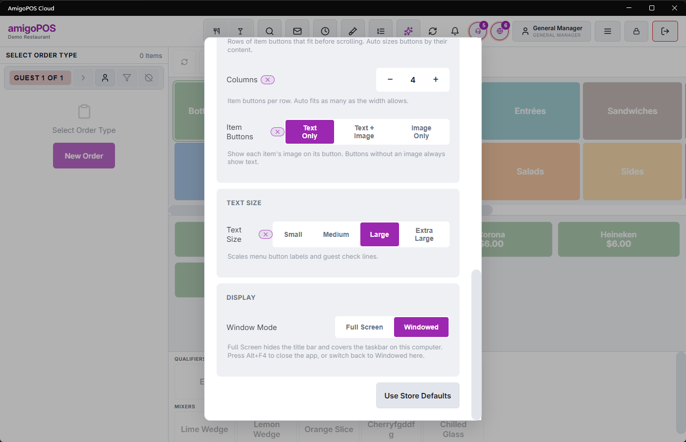
If the problem is that things are too small to read or too small to hit, a theme is not the answer. A manager can open Layout from the same row and set text size, category and item button sizing as rows and columns, and which side the guest check sits on. See Station layout and UI settings.
Those settings have a store default with a per-device override, so one awkward station can be fixed without changing everyone else.